Content
- Overview
- Best Practices
- Common Mistakes
- Vanity URLs
Note: to get step by step instructions on implementing our booking widgets
To view and download
- Customer examples: Marketing Examples: Booking Widgets
- Templates: Website Booking Templates
When you're done reading this article, next read: Workstream # 6: Design Digital Campaigns
Overview
- Your website is likely the first place where people interact with your health system, so it is
imperative to create an intuitive, user-friendly experience that will inform and guide patients into
checking in. - While we welcome each client to implement Save my Spot in a way that is unique
to their brand, we would like to share some of our UI expertise so that your website generates
conversions.
Best Practices
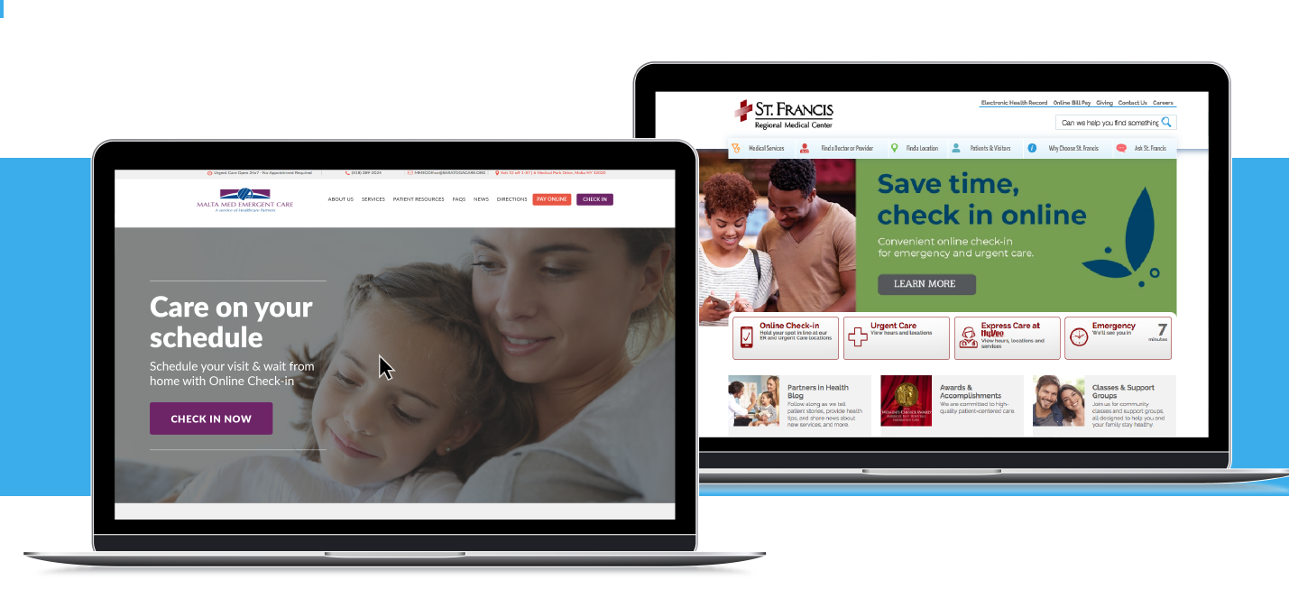
#1 Use your home page to advertise Check-in Express
- The best spot to advertise Save my Spot is your rotating banner because it is eye-catching
and above-the-fold. - Place a fixed anchor button on your menu and/or including a fixed banner
- Link to the hub page in the list of your quick links. This maintains visible links when different initiatives take over the rotating banner.
Customer Examples:
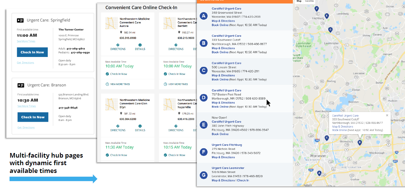
#2 Utilize our dynamic first available time widget
- For multi-facility clients, displaying the first available reservation time allows patients to
“comparison shop” locations for the time that works best for them, which also helps shift volume to your less busy locations. - For single facility clients, it is still useful to incorporate the first available time widget.
- However, it may go best below-the-fold on your home page.
- Some clients have incorporated it into their home page banner but be aware that if you have blocked out a chunk of available times, the code will render “Currently Accepting Walk-ins Only”.
- This could deter
patients from exploring further for times available later in the day
Customer Example:
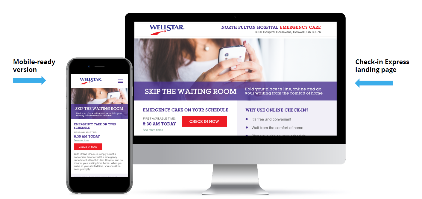
#3 Create a keyword-rich landing/hub page
- Not only can this page feature educational information for Save my Spot, but it can also
improve conversion rates and make your digital and print campaigns more successful. - Include information to answer the what, how, and why of Check-in Express.
- Address concerns with an FAQ section.
- Put an eye-catching banner on the page that matches your other campaign materials.
- Display all facilities using Check-in Express so patients can compare times and locations.
- Use keywords from your other campaign materials to keep your messaging consistent and
improve SEM (Search Engine Marketing) results.
Customer Examples
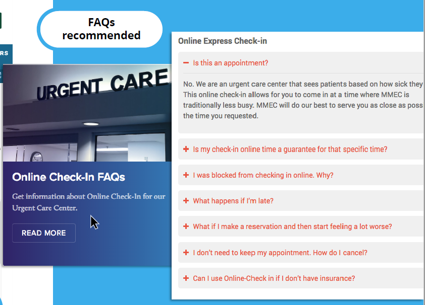
#4 Use our list of FAQs
- We provide a list of frequently asked questions and encourage you to incorporate this on your
website, preferably on the Save my Spot landing page and/or on the reservation form
page. - This is important because it answers important questions such as what patients should
do if they are running late and how many patients can be checked in for a single time slot.
Customer Example:
#5 Link to Check-in Express landing page throughout your website
- We recommend that you provide more than one way to access the online check-in service on
your website. - Place links on your location/directions page, contact page, about page, services
page, and if you have a quick links panel or floating side menu on your site, put it there as well. - These links can be structured as call-to-action buttons and show the first available reservation
times or they can be as simple as a text link saying “Check In Now”.
#6 Provide information on your reservation form page
- If patients are directed to the reservation form via PPC campaign or print marketing campaign,
they may not have had a chance to view any information about Check-in Express prior to
landing on this page. - Increase their understanding and build trust by providing a short description of what will happen when they submit the form, perhaps a link to your FAQ page and/or a link back to the informational landing page.
#7 Use consistent language & calls to action
- Whether you decide to use phrases like “Hold your spot” or “Schedule a visit”, make sure the campaign uses consistent language throughout the website to avoid any confusion.
#8 Include disclaimers
- To accurately set patient expectations, we recommend placing disclaimers on your Save-my-Spot-related pages.
- These disclaimers should say that the reservation time is not a guarantee and that patients with life-threatening conditions should call 911 or go straight to an ER.
- We will provide you with default disclaimers that you can customize.
- Please include additional information that patients should consider before visiting your facility on Check-in Express-related pages, such as pre-filling registration forms online, bringing insurance and identification cards, arriving early, or outlining special limitations
#9 Provide links to directions, contact information & your other services
- On Save-my-Spot-related pages, provide links to driving directions, contact information,
and/or location pages for your health system. - Patients may be less likely to book if they have to navigate away from the reservation form landing
page to find this information.
Common Mistakes
#1 Make Check-in Express difficult to find
- We understand your home page is precious real estate and you may have other important
initiatives to advertise, but your conversion rate will be low if you do not make Check-in
Express visible on your home page and/or within your main menu. - To increase visibility, we recommend
- Including a check-in link in 1-2 places on your home page, with one of them preferably being near the top of the page.
- Use bold text, relevant imagery, and/or a colorful call to action button to get noticed.
#2 Link out to reservation iframe (instead of embedding it on the health system website):
- Our iframe reservation form is designed to be housed within your website’s structure in order to ensure a seamless experience for your patients.
- Redirecting patients to a blank page with an irrelevant URL (apps10.erexpress.com) and no navigational menu or health system logo is a jarring experience.
#3 Mislabel Check-in Express as ‘wait times’ or ‘telehealth’
- Some clients may have more than one way to access emergent health services and may
choose to house those options in one place. - This can work well for organizational purposes, but make sure your labeling is clear and patients understand how each option works.
#4 Go overboard on disclaimers
- While you want to set clear expectations, you do not want to scare patients away from using
Save my Spot.
#5 Go overboard on keywords
- Relevant keywords are great.
- However, patients will not appreciate a page stuffed with “online check-in” 50 times, and neither will search engines.
- In fact, Google rewards quality, unique content and could penalize you for keyword stuffing and give your site a low ranking
Vanity URLs
- A vanity URL is a shortened link that patients can easily remember, use and share.
- Vanity URLs are best utilized for redirecting patients to a specific page on your website that normally has a long URL.
- All it takes is a simple 301 redirect, which is a permanent redirect from one URL (your vanity
URL) to another (your actual landing page URL).
Benefits
- Build trust: Vanity URLs tend to include your brand name and/or a relevant keyword from
your marketing campaign or service. - Set expectations: Your vanity URL should be a clear indication of what users will experience once they land on the web page.
- Makes it memorable: A shortened link will make it easy for patients to remember and share
with others. - Tracks effectiveness of offline campaigns: Placing your vanity URL on offline marketing
efforts such as posters, direct mailers, radio announcements, or billboards combined with
vanity URL tracking will allow better insight into the effectiveness of your campaigns.
Best Practices
- Keep it short and simple – Stick to a two or three-word phrase incorporating keywords from
your brand name, service, or campaign. It should easily fit on print materials. Do not use words
with complicated or unusual spellings. - Avoid acronyms – Avoid acronyms unless your patients commonly associate you with one.
- Avoid special characters – Avoid special characters in your vanity URL to make it easier to
remember and less likely that patients will type it incorrectly. Instead of hyphens or forward
slashes, try adding a sub-domain if necessary (i.e. schedule.urgentcare.com). - Use title case – For better clarity, capitalize the first letter of every word in your URL. For
example, eratmemorial.com brings “rat” to mind while ERatMemorial.com makes you think
“ER”. - Use color or bolding – An alternative way to increase clarity, if you decide to keep your vanity
URL lowercase is to use color or bolding. - Do not use ‘www’ – Placing ‘www’ before URLs is no longer necessary and wastes space on
advertisements.
Set-Up
- Create a Vanity URL and purchase it by using a domain registration site such as GoDaddy.com
or the site that is currently hosting your website. - Have your web developer set up a 301 permanent redirect from the vanity URL to the actual
URL of your Save my Spot landing page.